07-27-2026

<p>There is a version of personalization that works, and a version that makes people trust you less than a blank envelope would. Everyone has received the letter that used their first name four separate times, and still felt like it came off an assembly line. Personalized direct mail earns responses when it feels genuinely human, and it backfires the instant the reader senses the personal touch is a performance.</p>  <p>That risk is what makes this harder than it looks. Doing nothing is safe and forgettable. Doing it badly is worse than doing nothing, because a failed attempt at intimacy reads as manipulation. The margin between the two is narrower than most campaigns allow.</p>  <div class="lp-order-btn-wrap">   <a class="lp-order-btn" href="https://letterprinting.net/product_list.html">ORDER NOW &rarr;</a> </div>  <h2>Why Fake Personalization Costs You More Than None</h2>  <p>Readers spot mail merge tricks instantly. They have seen them for decades. The name dropped into the salutation, the city inserted mid-paragraph, the reference to "your neighborhood" that could apply to any of forty thousand people, all of it registered as automation wearing a mask.</p>  <p>Overusing the name is the most common tell. Real correspondence uses someone's name once, maybe twice. A letter that repeats it every third paragraph is not being warm; it is demonstrating that it knows how to insert a variable, and readers hear the difference immediately.</p>  <p>The mismatch does the most damage. A piece that looks personal on the outside and reads like a corporate announcement inside creates a jarring conflict, and the reader resolves it by deciding they were tricked. That conclusion is hard to walk back. Once trust breaks, the offer stops mattering entirely, no matter how good it was.</p>  <p>This is the asymmetry at the heart of it. Personalization that lands raises responses modestly. Personalization that fails does not just fail to help; it actively converts an interested reader into a skeptical one.</p>  <style>   .lp-custom-cta { background-color:#0f2f93; color:#ffffff; padding:50px 30px; margin:40px 0; text-align:center; border-radius:8px; }   .lp-cta-inner h3 { color:#ffffff !important; font-size:26px; font-weight:700; margin-top:0; margin-bottom:10px; }   .lp-cta-inner p { color:#e0e0e0; font-size:16px; margin-bottom:30px; }   .lp-cta-actions { display:flex; justify-content:center; gap:15px; flex-wrap:wrap; }   .lp-btn-primary { background-color:#ffbb00 !important; color:#0f2f93 !important; padding:15px 35px; text-decoration:none !important; font-weight:700; font-size:15px; border-radius:4px; display:inline-flex; align-items:center; transition:transform 0.2s ease, background 0.3s ease; }   .lp-arrow { margin-left:10px; font-size:18px; }   .lp-btn-secondary { background-color:transparent; color:#ffffff !important; border:2px solid #ffffff; padding:13px 33px; text-decoration:none !important; font-weight:700; font-size:15px; border-radius:4px; display:inline-flex; align-items:center; transition:all 0.3s ease; }   .lp-btn-primary:hover { background-color:#e6b800 !important; transform:scale(1.05); }   .lp-btn-secondary:hover { background-color:#ffffff; color:#0f2f93 !important; }   .lp-order-btn-wrap { text-align:center; margin:24px 0; }   .lp-order-btn { display:inline-block; background-color:#ffbb00; color:#0f2f93 !important; border:2px solid #0f2f93; padding:14px 36px; font-weight:700; font-size:16px; border-radius:4px; text-decoration:none !important; letter-spacing:0.5px; transition:background-color 0.3s ease, transform 0.2s ease; }   .lp-order-btn:hover { background-color:#e6b800; transform:scale(1.05); }   @media (max-width:600px) {     .lp-cta-actions { flex-direction:column; }     .lp-btn-primary, .lp-btn-secondary, .lp-order-btn { width:100%; box-sizing:border-box; }   } </style> <div class="lp-custom-cta">   <div class="lp-cta-inner">     <h3>Ready to Boost Your Direct Mail Response?</h3>     <p>Get professional printing and mailing services tailored to your campaign goals.</p>     <div class="lp-cta-actions">       <a class="lp-btn-primary" href="https://letterprinting.net/product_list.html">ORDER NOW <span class="lp-arrow">&rarr;</span></a>       <a class="lp-btn-secondary" href="https://letterprinting.net/quote_create.php">GET A QUOTE</a>     </div>   </div> </div>  <h2>What Genuine Personalization Looks Like</h2>  <p>The difference between real and fake personalization is whether the personal detail is doing any work.</p>  <p>Real personalization uses details that prove you know something true about the recipient. Not their name, which is available to anyone with a list, but their situation, their property, their industry, their history with you. A detail that a mass mailer could not plausibly have is worth more than ten that any mailer could.</p>  <p>The message itself should be shaped to the situation, not just decorated with variables. This is a copy decision more than a data decision. Two versions of a letter written for two genuinely different audiences will outperform one letter with fields inserted, even if the field version technically contains more "personalized" elements.</p>  <p>Restraint matters more than volume here. One relevant detail beats five inserted fields, because one detail reads as attention and five reads as a database. Modern <a href="https://letterprinting.net/personalized-direct-mail.html">personalized direct mail</a> and <a href="https://letterprinting.net/mail-merge-benefits.html">mail merge services</a> can insert almost anything, which is exactly why the discipline to insert very little has become the differentiator.</p>  <div class="lp-order-btn-wrap">   <a class="lp-order-btn" href="https://letterprinting.net/product_list.html">ORDER NOW &rarr;</a> </div>  <h2>Writing in a Voice People Believe</h2>  <p>Personalization fails at the sentence level as often as at the data level. The most common problem is that a brand, rather than a person, wrote the piece.</p>  <p>Write the way someone talks. Short sentences. Plain words. The rhythm of speech rather than the rhythm of a press release. This is not about being casual; a formal letter can still sound like a human being wrote it. It is about the difference between the language chosen to communicate and the language chosen to sound professional.</p>  <p>Skip the marketing vocabulary. Every mailer in the stack promises solutions, values, and commitment to excellence. Those words have been worn smooth from use, and they now signal nothing except that a marketer was involved. Concrete beats abstract, always.</p>  <p>A real signature and a real name outperform a department. "Sincerely, the Customer Care Team" is nobody. A person with a name, a title, and a signature is somebody, and readers respond to somebody. The <a href="https://letterprinting.net/letterheads/">letterhead and formatting</a> around that signature should support the impression rather than undercut it.</p>  <h2>Trust Signals That Do the Heavy Lifting</h2>  <p>Warmth alone does not earn a response. The reader has to believe you can do what you say, and belief comes from evidence rather than from tone.</p>  <p><strong>Proof.</strong> Years in business, number of clients served, concrete results. Specifics that could be checked read as true precisely because they could be checked.</p>  <p><strong>Testimonials and names that they can verify.</strong> A quote from a real, identifiable customer carries weight that an anonymous rave never will. Your <a href="https://letterprinting.net/testimonials.html">testimonials</a> page exists for the same reason.</p>  <p><strong>A real address and a real phone number.</strong> Not just a web form. A business willing to publish where it is and how to reach a person is making a small, meaningful commitment.</p>  <p><strong>Professional print quality.</strong> This one gets ignored constantly. Sloppy production reads as risk because a company that cannot get its own letter right invites questions about everything else. The physical quality of the paper and printing is a trust signal, whether you intended it as one or not.</p>  <p><strong>Clear terms with nothing hidden.</strong> Fine print that seems to be concealing something confirms every suspicion the reader arrived with. Plain terms disarm them.</p>  <div class="lp-order-btn-wrap">   <a class="lp-order-btn" href="https://letterprinting.net/product_list.html">ORDER NOW &rarr;</a> </div>  <h2>Matching the Format to the Promise</h2>  <p>The last piece is consistency, and it is where well-intentioned campaigns most often break.</p>  <p>A handwritten-style piece has to carry a personal message inside. If someone opens a <a href="https://letterprinting.net/yellowletters/">yellow letter</a> that looks handwritten on the envelope and finds a glossy corporate pitch, the format has made a promise that the content breaks. That reader will not just ignore the offer; they will feel misled by it. The same logic applies to <a href="https://letterprinting.net/handwrittenfonts.html">handwritten fonts</a> generally, which work beautifully when the message matches and poorly when it does not.</p>  <p>A formal business letter should look and sound like it came from a professional. That is its own kind of honesty, and it suits offers where credibility matters more than warmth.</p>  <p>Mismatched format and tone are what make mail feel like a trick, and readers are unusually good at detecting it. Consistency between envelope, copy, offer, and format is not an aesthetic preference. It is the mechanism by which a reader decides you are what you appear to be. Our piece on <a href="https://letterprinting.net/why-a-handwritten-envelope-is-more-personal.html">why a handwritten envelope is more personal</a> explores how that consistency plays out in practice.</p>  <h2>Conclusion</h2>  <p>Personalized direct mail works when the personal part is true. Use details that are real, write in a voice that sounds like a person rather than a brand, back the warmth with proof the reader can verify, and keep the format honest about what is inside. Readers can tell the difference between attention and automation, and they always could. The ones who believe you are the ones who respond.</p>  <p><strong>About LetterPrinting.net:</strong> <a href="https://letterprinting.net/contact-us.html">LetterPrinting.net</a> produces personalized direct mail for small and mid-size businesses, from variable data printing to handwritten-style pieces, all handled in-house so the personal touch holds up across the entire run. The team offers complete one-stop print and mail solutions built to be affordable and consistent. Reach <a href="https://letterprinting.net/contact-us.html">LetterPrinting.net</a> or call the Direct Mail Services department at 866-558-6365.</p>  <div class="lp-order-btn-wrap">   <a class="lp-order-btn" href="https://letterprinting.net/product_list.html">ORDER NOW &rarr;</a> </div>  <h3>Frequently Asked Questions</h3>  <p><strong>Does personalization actually improve direct mail response rates?</strong></p>  <p>Genuine personalization does, because it signals relevance. Superficial personalization can lower response, since readers recognize inserted fields as automation and trust the sender less as a result.</p>  <p><strong>How much personalization is too much in direct mail?</strong></p>  <p>When the personal details start drawing attention to themselves, you have crossed the line. One meaningful detail reads as attention, while repeated name drops and inserted variables read as a database.</p>  <p><strong>What makes a direct mail piece feel trustworthy?</strong></p>  <p>Verifiable proof, a real name and signature, a real address and phone number, professional print quality, and terms stated plainly with nothing buried in fine print.</p>  <p><strong>Should I use a handwritten font in direct mail?</strong></p>  <p>Only when the message inside matches the promise on the outside. A handwritten look paired with a corporate pitch feels like a trick, while a handwritten look paired with a genuinely personal note works well.</p>  <p><strong>How do I personalize direct mail without a large database?</strong></p>  <p>Segment your list into a few genuinely different groups and write a version for each. Two letters written for two real audiences beat one letter with names inserted, and neither requires much data.</p>  <p><em>Written by The Letterprinting Team</em> | 22 July, 2026</p>

There is a version of personalization that works, and a version that makes people trust you less than a blank envelope would. Everyone has received the letter that used their first name four separate times, and still felt like it came off an assembly line. Personalized direct mail earns responses when it feels genuinely human, and it backfires the instant the reader senses the personal touch is a performance.

That risk is what makes this harder than it looks. Doing nothing is safe and forgettable. Doing it badly is worse than doing nothing, because a failed attempt at intimacy reads as manipulation. The margin between the two is narrower than most campaigns allow.

Why Fake Personalization Costs You More Than None

Readers spot mail merge tricks instantly. They have seen them for decades. The name dropped into the salutation, the city inserted mid-paragraph, the reference to "your neighborhood" that could apply to any of forty thousand people, all of it registered as automation wearing a mask.

Overusing the name is the most common tell. Real correspondence uses someone's name once, maybe twice. A letter that repeats it every third paragraph is not being warm; it is demonstrating that it knows how to insert a variable, and readers hear the difference immediately.

The mismatch does the most damage. A piece that looks personal on the outside and reads like a corporate announcement inside creates a jarring conflict, and the reader resolves it by deciding they were tricked. That conclusion is hard to walk back. Once trust breaks, the offer stops mattering entirely, no matter how good it was.

This is the asymmetry at the heart of it. Personalization that lands raises responses modestly. Personalization that fails does not just fail to help; it actively converts an interested reader into a skeptical one.

Ready to Boost Your Direct Mail Response?

Get professional printing and mailing services tailored to your campaign goals.

What Genuine Personalization Looks Like

The difference between real and fake personalization is whether the personal detail is doing any work.

Real personalization uses details that prove you know something true about the recipient. Not their name, which is available to anyone with a list, but their situation, their property, their industry, their history with you. A detail that a mass mailer could not plausibly have is worth more than ten that any mailer could.

The message itself should be shaped to the situation, not just decorated with variables. This is a copy decision more than a data decision. Two versions of a letter written for two genuinely different audiences will outperform one letter with fields inserted, even if the field version technically contains more "personalized" elements.

Restraint matters more than volume here. One relevant detail beats five inserted fields, because one detail reads as attention and five reads as a database. Modern personalized direct mail and mail merge services can insert almost anything, which is exactly why the discipline to insert very little has become the differentiator.

Writing in a Voice People Believe

Personalization fails at the sentence level as often as at the data level. The most common problem is that a brand, rather than a person, wrote the piece.

Write the way someone talks. Short sentences. Plain words. The rhythm of speech rather than the rhythm of a press release. This is not about being casual; a formal letter can still sound like a human being wrote it. It is about the difference between the language chosen to communicate and the language chosen to sound professional.

Skip the marketing vocabulary. Every mailer in the stack promises solutions, values, and commitment to excellence. Those words have been worn smooth from use, and they now signal nothing except that a marketer was involved. Concrete beats abstract, always.

A real signature and a real name outperform a department. "Sincerely, the Customer Care Team" is nobody. A person with a name, a title, and a signature is somebody, and readers respond to somebody. The letterhead and formatting around that signature should support the impression rather than undercut it.

Trust Signals That Do the Heavy Lifting

Warmth alone does not earn a response. The reader has to believe you can do what you say, and belief comes from evidence rather than from tone.

Proof. Years in business, number of clients served, concrete results. Specifics that could be checked read as true precisely because they could be checked.

Testimonials and names that they can verify. A quote from a real, identifiable customer carries weight that an anonymous rave never will. Your testimonials page exists for the same reason.

A real address and a real phone number. Not just a web form. A business willing to publish where it is and how to reach a person is making a small, meaningful commitment.

Professional print quality. This one gets ignored constantly. Sloppy production reads as risk because a company that cannot get its own letter right invites questions about everything else. The physical quality of the paper and printing is a trust signal, whether you intended it as one or not.

Clear terms with nothing hidden. Fine print that seems to be concealing something confirms every suspicion the reader arrived with. Plain terms disarm them.

Matching the Format to the Promise

The last piece is consistency, and it is where well-intentioned campaigns most often break.

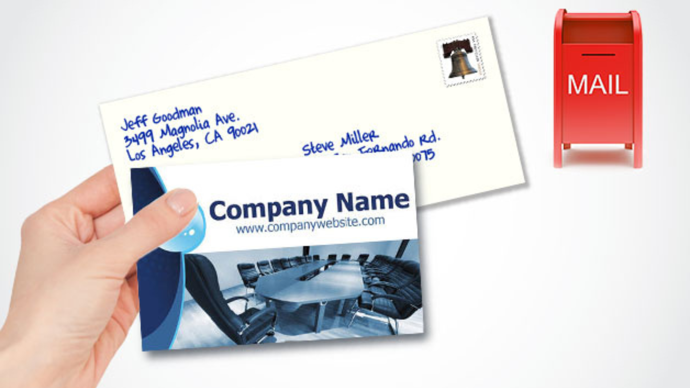
A handwritten-style piece has to carry a personal message inside. If someone opens a yellow letter that looks handwritten on the envelope and finds a glossy corporate pitch, the format has made a promise that the content breaks. That reader will not just ignore the offer; they will feel misled by it. The same logic applies to handwritten fonts generally, which work beautifully when the message matches and poorly when it does not.

A formal business letter should look and sound like it came from a professional. That is its own kind of honesty, and it suits offers where credibility matters more than warmth.

Mismatched format and tone are what make mail feel like a trick, and readers are unusually good at detecting it. Consistency between envelope, copy, offer, and format is not an aesthetic preference. It is the mechanism by which a reader decides you are what you appear to be. Our piece on why a handwritten envelope is more personal explores how that consistency plays out in practice.

Conclusion

Personalized direct mail works when the personal part is true. Use details that are real, write in a voice that sounds like a person rather than a brand, back the warmth with proof the reader can verify, and keep the format honest about what is inside. Readers can tell the difference between attention and automation, and they always could. The ones who believe you are the ones who respond.

About LetterPrinting.net:LetterPrinting.net produces personalized direct mail for small and mid-size businesses, from variable data printing to handwritten-style pieces, all handled in-house so the personal touch holds up across the entire run. The team offers complete one-stop print and mail solutions built to be affordable and consistent. Reach LetterPrinting.net or call the Direct Mail Services department at 866-558-6365.

Frequently Asked Questions

Does personalization actually improve direct mail response rates?

Genuine personalization does, because it signals relevance. Superficial personalization can lower response, since readers recognize inserted fields as automation and trust the sender less as a result.

How much personalization is too much in direct mail?

When the personal details start drawing attention to themselves, you have crossed the line. One meaningful detail reads as attention, while repeated name drops and inserted variables read as a database.

What makes a direct mail piece feel trustworthy?

Verifiable proof, a real name and signature, a real address and phone number, professional print quality, and terms stated plainly with nothing buried in fine print.

Should I use a handwritten font in direct mail?

Only when the message inside matches the promise on the outside. A handwritten look paired with a corporate pitch feels like a trick, while a handwritten look paired with a genuinely personal note works well.

How do I personalize direct mail without a large database?

Segment your list into a few genuinely different groups and write a version for each. Two letters written for two real audiences beat one letter with names inserted, and neither requires much data.

Written by The Letterprinting Team | 22 July, 2026