What Makes Someone Open a Piece of Direct Mail Instead of Throwing It Away?
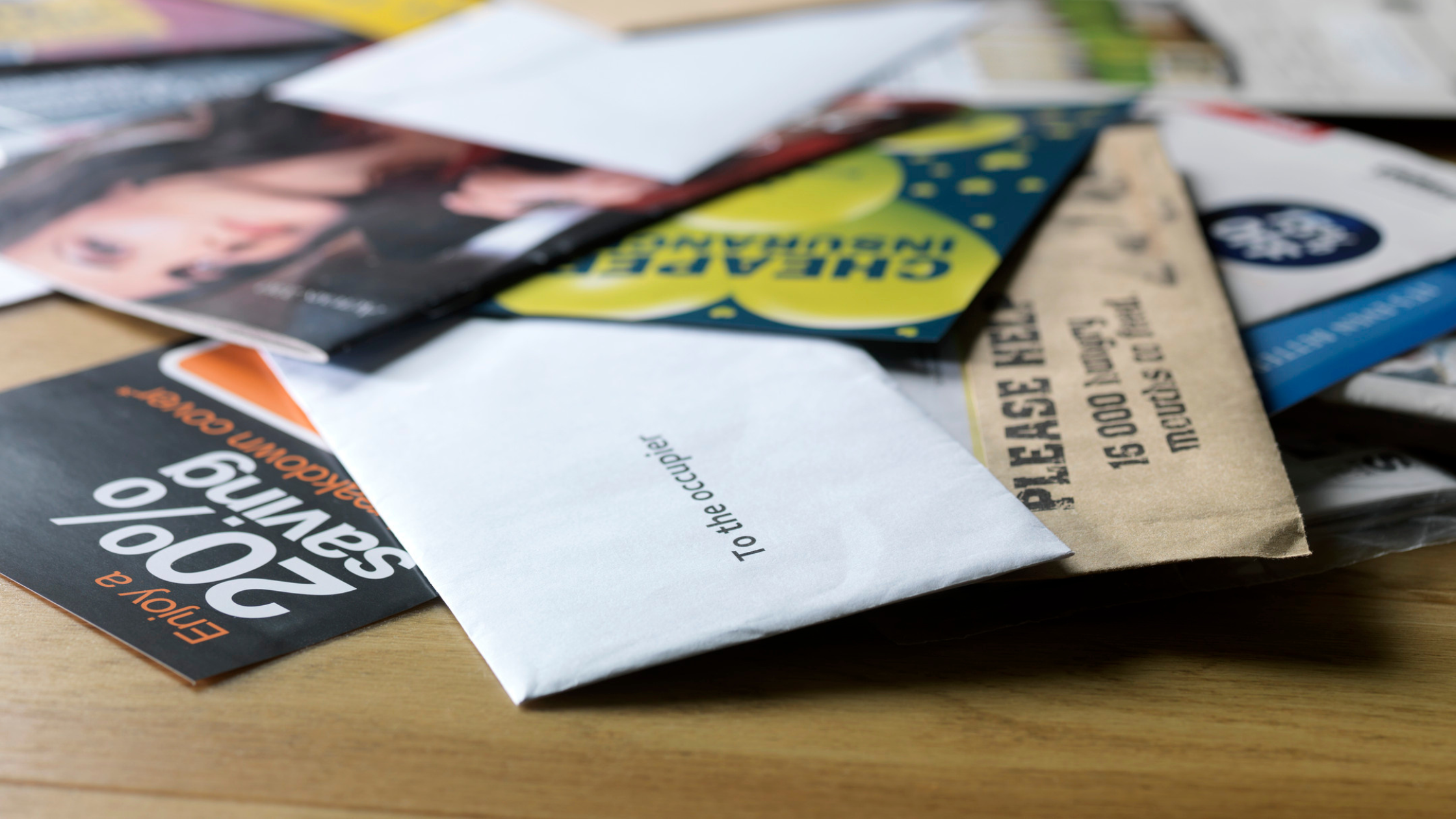
Every piece of direct mail faces the same judgment, and it happens somewhere between the mailbox and the kitchen counter. People sort their mail standing up, usually within arm's reach of a trash can, and they split the stack into two piles in a matter of seconds. Almost nobody could explain why one envelope gets opened while the one behind it goes straight to recycling, because the decision happens faster than conscious thought. That does not make it random. It follows a pattern, and once you understand the pattern, you can build mail that consistently lands on the right side of it.
The uncomfortable truth for most marketers is that this decision has nothing to do with how good the message inside is. Your offer could be the best thing that the recipient sees all year, and it will never matter if the envelope loses the three-second sort. Everything you spend on copy, design, and printing rides on a judgment made before a single word gets read.
Ready to Boost Your Direct Mail Response?
Get professional printing and mailing services tailored to your campaign goals.
The Three Second Sort Nobody Talks About
Watch anyone go through their mail, and you will see the same behavior. They flip through the stack quickly, glancing at each piece for a moment, and they make a keep or toss call on the spot. Bills and anything that looks personal go in one pile. Everything that reads as advertising goes in the other, often without ever being turned over.
This sort runs on instinct rather than analysis. The recipient is not weighing your value proposition because they have not read it. They are reacting to a handful of visual signals that their brain has learned to associate with "worth my time" or "not worth my time" after years of receiving mail. Those signals are simple, they are consistent, and they are entirely within your control.
Winning that moment matters more than anything else in the campaign. A piece that survives the sort earns the chance to persuade. A piece that fails might as well have never been printed. This is why experienced mailers obsess over the outside of the envelope while beginners pour all their energy into the letter inside.
What Signals Junk Before a Word Gets Read
Recipients have built a mental filter, and certain features trip it instantly. Most of them are things businesses do for convenience or cost savings, without realizing what they cost in open rates.
Printed address labels. A white sticker with a name printed on it announces a mass mailing before anything else registers. Real correspondence does not arrive with a label slapped on the front.
Bulk postage marks. A printed indicia or a permit imprint tells the reader that thousands of identical pieces went out the same day. It is a functional detail that carries an unintended message.
Heavy sales design on the outside. Glossy finishes, starbursts, price callouts, and urgent color schemes all shout advertisement. The louder the exterior sells, the faster it gets discarded.
Generic greetings and no personal details. When nothing in the piece suggests it was meant for this specific person, the reader has no reason to treat it as anything but a broadcast.
Familiarity. If your piece looks like the last five offers they threw away, it inherits their fate automatically. Pattern matching is exactly what the three-second sort is built on.
None of these things is fatal on its own, but they stack. Two or three of them together, and the piece is gone before it ever reaches the counter. Our guide on direct mail marketing ideas that keep your mail from looking like junk covers this problem in more depth.
What Makes a Mail Piece Look Important Instead
The good news is that the signals work in both directions. The same instinct that condemns obvious advertising rewards mail that carries the markers of genuine correspondence.
Personal looking addressing does more work than almost anything else. Hand-addressing envelopes, or using a handwriting style that convincingly imitates it, suggests that a person sat down and wrote the recipient's name. That single detail moves a piece out of the advertising category in the reader's mind before they have consciously registered why.
A live stamp does something similar. Affixing real postage instead of printing a bulk mark signals effort and intention. Stamps cost more per piece, and readers understand that intuitively, which is exactly why the stamp reads as a mark of respect rather than an expense.
Clean, restrained design also helps. A piece that does not shout gives the impression that it does not need to. Blank space, a simple typeface, and no promotional clutter on the exterior all read as confidence.
Format matters too. A piece that breaks the physical pattern of the rest of the stack, whether through a different size, a different paper, or a different shape, earns a second look purely because it interrupts the rhythm of the sort. A snap pack mailer works on exactly this principle, since its perforated construction reads as something official rather than something optional.
Finally, the sender's name carries weight. If the recipient recognizes you, or if the name suggests something relevant to their life, that alone can carry the piece past the filter.
Curiosity Beats Persuasion at the Mailbox
Here is where a lot of otherwise smart campaigns go wrong. Marketers put their best headline on the outside of the envelope, reasoning that the strongest message deserves the most visible spot. In practice, this hands the reader everything they need to decide without opening anything.
An unopened envelope cannot persuade anyone of anything. When your best pitch sits on the exterior, the recipient evaluates and rejects the offer in the same instant they identify the piece as advertising. You gave away the reason to open before asking them to open.
Mystery works better. An envelope that raises a question, or simply reveals nothing at all, leaves the reader with only one way to satisfy their curiosity. Teaser copy can support this when it hints without explaining, but it turns destructive the moment it starts selling. The distinction is simple. Copy that makes someone wonder helps. Copy that makes someone decide hurts.
The job of the outside of the piece is narrow and specific. It is not to sell, not to explain, and not to summarize. It is to earn the open. Everything else happens on the inside, where you have the reader's attention and the room to use it.
Relevance Is the Quiet Deciding Factor
All of the design and production advice in the world runs into a hard ceiling, and that ceiling is the list. People open mail that appears to be about them or their situation. Nothing about your envelope can manufacture relevance that does not exist.
A local reference, a detail specific to their property or business, or a message that speaks to a circumstance they are actually in, all of these signal that the piece is not a broadcast. That signal is powerful because it is difficult to fake, and readers know it. This is where personalized direct mail earns its keep, using real data to make each piece genuinely specific rather than superficially customized.
The reverse is equally true. Send a beautifully produced, hand-addressed, stamped envelope to someone who has no possible use for what is inside, and it goes in the recycling with everything else. Accurate, well-maintained mailing lists set the upper limit on what every other choice can achieve. Running those addresses through NCOA processing before the drop keeps your budget from paying postage on people who moved two years ago.
Get the list right first, then let the envelope do its job. Reverse that order, and you are optimizing the packaging on a message nobody wanted.
Conclusion
Whether a piece of direct mail gets opened comes down to a handful of visual signals the recipient reads in seconds, without ever consciously deciding anything. Look personal, look intentional, and look relevant. Avoid anything that announces itself as advertising, resist the urge to sell on the outside, and start from a list of people the message actually fits. Get those pieces right, and your direct mail earns the one thing it needs above all else, the chance to be read.
About LetterPrinting.net:LetterPrinting.net helps small and mid-size businesses produce mail that gets opened, handling printing, addressing, postage, and USPS delivery in-house so every detail supports the piece instead of undermining it. The team specializes in complete one-stop print and mail solutions that stay affordable and consistent because our success depends on your success. Call the Direct Mail Services department at 866-558-6365 or reach LetterPrinting.net to plan your next campaign.
Frequently Asked Questions
Why do people throw away direct mail without opening it?
Because they sort mail on instinct in a few seconds, reacting to visual signals rather than reading. Printed labels, bulk postage marks, and glossy sales design all identify a piece as advertising, and most people discard advertising without opening it.
Does a real stamp actually increase direct mail open rates?
A live stamp signals effort and personal intent, which moves a piece away from the junk mail category in the reader's mind. It costs more per piece, but for campaigns where the open rate drives everything, it frequently pays for itself.
What should go on the outside of a direct mail envelope?
As little as possible beyond a personal-looking address and real postage. The exterior only needs to earn the opening, so anything that sells or explains gives the reader a reason to decide before opening.
Do handwritten-style envelopes open more often?
Yes, in most cases. A handwritten address suggests a real person wrote it, which is one of the strongest signals that a piece is genuine correspondence rather than a mass mailing.
How can I tell whether my mail piece looks like junk mail?
Put it in a stack with your own mail and flip through it quickly without thinking. If your eye passes over it the same way it passes over the offers you throw away, the piece has a recognition problem, not a message problem.
Written by The Letterprinting Team | 6 July, 2026


